Designing an Airline Application to Simplify The Booking Process
Booking Challenge
We regularly purchase tickets, services, check availability, compare prices, or try different rules. As a result, we often experience difficulties and frustration to complete the booking or modifying our existing trip.

Project Overview
During the project, I performed usability tests and interviews to learn more about context.
Worked on competitive analysis to see how strength & weakness, affinity diagram and empathy map to analyse data.
Created customer journey maps, sketched flows and wireframes to ideate.
Designed high-fidelity design and clickable prototype.
My Role
User Experience Designer
The Design Process
1. Research
Competitive Benchmarking
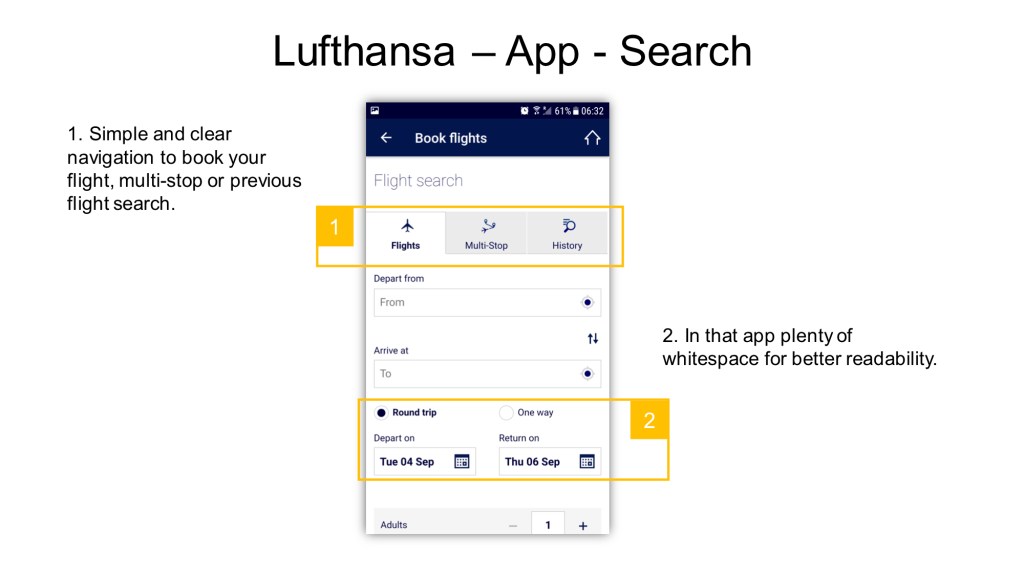
Competitive benchmarking is time-consuming, but it’s a great tool to discover weak and robust competitors.
Survey
I edited and sent out a 6-question online survey to gain more information about airline website experiences.
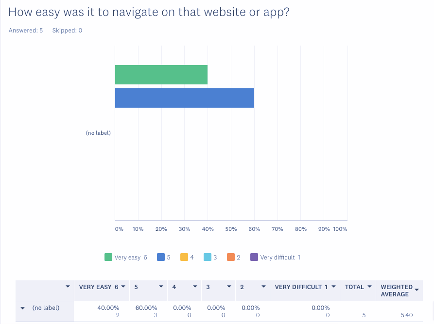
Most users did not have significant difficulty during the website navigations.
Most of the time, they were able to complete their task and booking.
The two main task to website or app was to check in and compare prices.
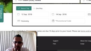
Interview and Usability Test
The depth-interview and usability test helped me discover more details about the user’s goal, behavioural and context. For this test, I looked for confident computer and smartphone users who had already booked flights.
A middle-aged man. He usually travels about 2-3 times a year to the Mediterranean area or any other European country with his fiancee.
A single man who usually visits his family and organises short trips with his friends. He books one ticket at a time. He tries to find the best deals, and he flies through different airports to get to the destination.

She always makes a plan about the yearly travel possibilities with her family about three times a year. They are looking for great deals and mostly direct flights.
Users like flexibility during date selection.
They don’t like hidden costs and feels frustrated because of too many extras and ads.
2. Analysis
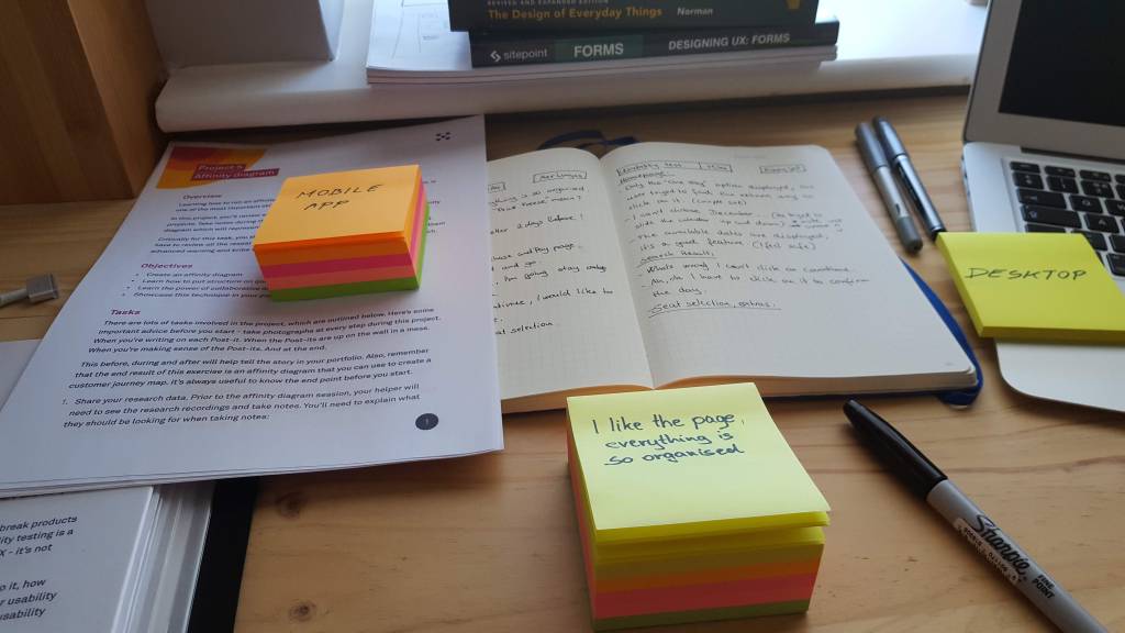
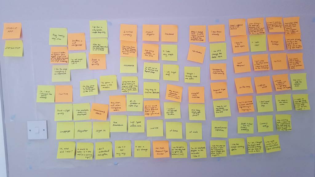
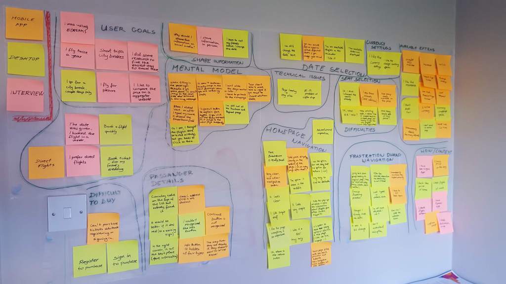
Affinity Diagram
We took notes and placed all pieces of insight on post-it notes. Arranged them into sensible groups; user needs, behaviours, and goals. Those groups reflect each step a user would usually take during a flight booking process.
Empathy Map
That mapping process helped me to understand and prioritise user needs and empathise with our users.

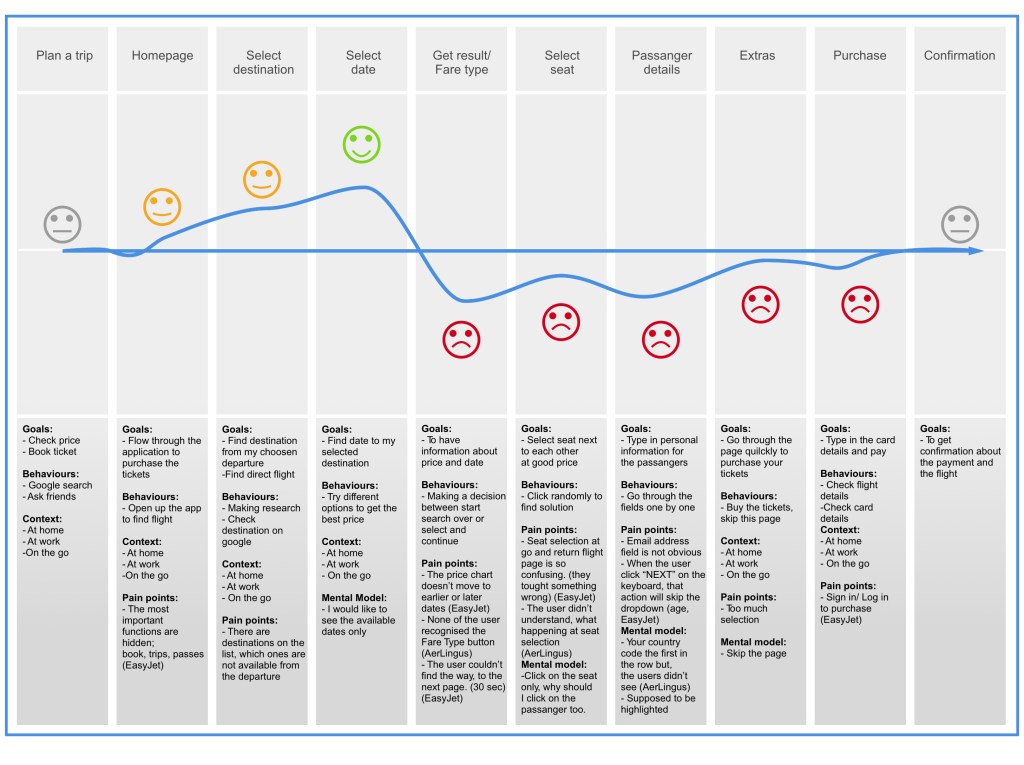
Customer Journey Mapping
At this point, I had a lot of information about the users. I addressed the user’s goal, behaviour, context and pain points.
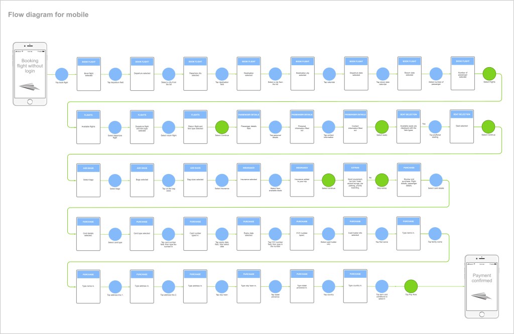
User Flow
I defined the high-level user flow for my primary use case. For example, people usually try to find the best price-date combination to book their next journey. We could help them to make those steps more manageable.
3. Design
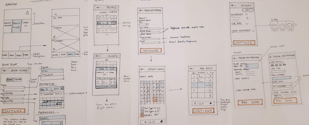
Sketching Ideas
The effective navigation will show us what is on the page and how to use it.
4. Prototype
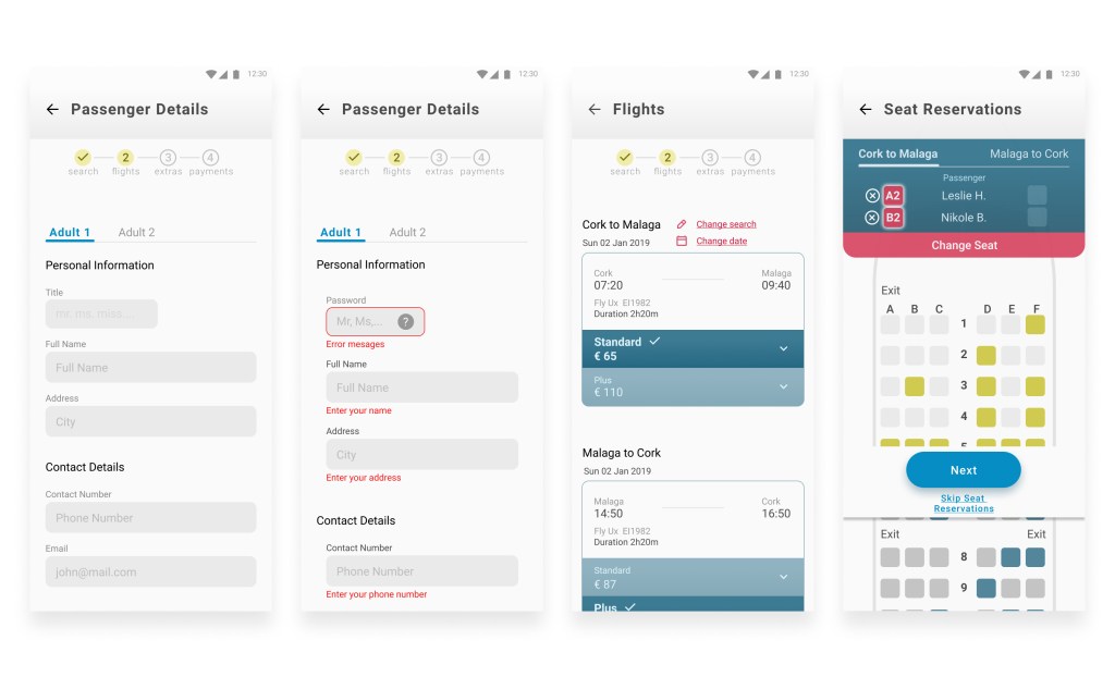
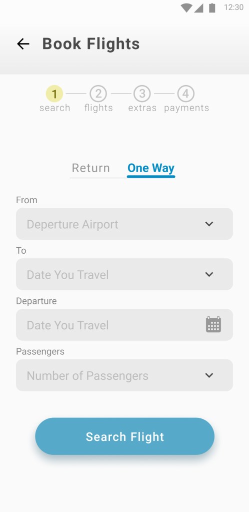
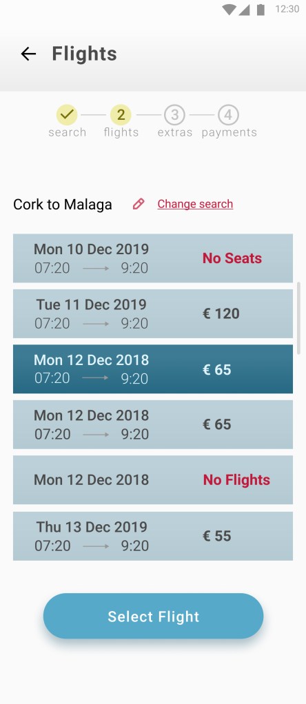
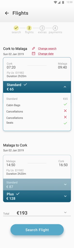
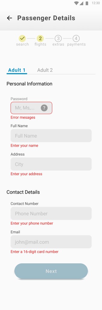
High-Fidelity Screens

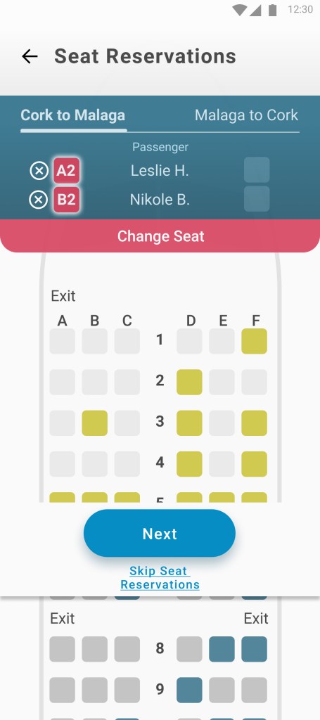


Seat Reservation
Figma link is here: https://www.figma.com/proto/61SeqUDbUxWmICbpOXjI9d/Fly-UX?page-id=0%3A1&node-id=182%3A6517&viewport=263%2C48%2C0.28&scaling=min-zoom&starting-point-node-id=182%3A6517&show-proto-sidebar=1
Lessons & Learnings
What I Learned
For example, we can easily get lost in fine detail during design, but solving the users’ problem is more important.
I discovered several more minor problems that were consistent on several applications I reviewed.
What I’d Differently
I would focus more on low-fidelity sketches because I could effectively create simple drawings quickly with
pen and paper. It is relatively easy to do several iterations and share and validate them with different stakeholders.
What is Next
The next would be to conduct a usability test with several people to see how I solved the pain points discovered during research and analysis. That would be another opportunity for fine-tuning the product to serve business and user needs.
See More Work

Bank for You
UI Design
This project was part of the UI Certification program through
Glasgow Caledonian University and the UX Design Institute.

Leave a comment